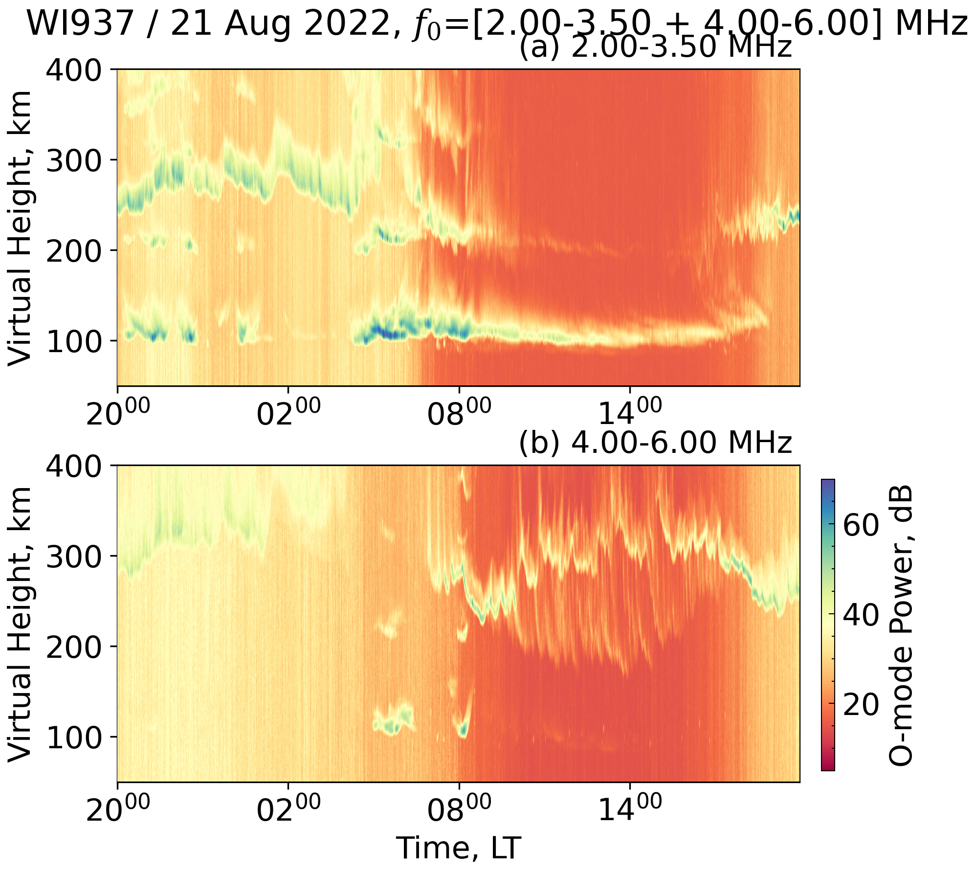
VIPIR FTI Interval Plot Example
This example demonstrates how to turn a directory of VIPIR NGI ionogram files into
an O-mode frequency–time interval (FTI) plot suitable for documentation.
The workflow lives in examples/vipir/fti.py and is intended to be customised
with your own campaign archive or station of interest.
Prerequisites
- A collection of VIPIR NGI files organised by day, e.g.
<root>/<year>/<doy>/ionogram/*.ngi[.bz2]. pynasondedependencies installed (seedocs/user/install.md).- Optional: set
VIPIR_SPEED_DEMON_ROOTto the base directory of your archive to avoid editing the script.
Running the example
The script will copy a day's worth of ionograms into /tmp/vipir_fti/,
generate a flattened RTI dataframe with generate_fti_profiles, and create a
figure inside docs/examples/figures/. Inspect fig_file_name and flim
arguments in the call to tune the output path and frequency window.
Using the helper directly
from examples.vipir.fti import generate_fti_profiles

rti = generate_fti_profiles(
    folder="/path/to/ngi/files",
    fig_file_name="docs/examples/figures/my_fti.png",
    fig_title="My Campaign / 2024-03-21",
    stn="WI937",
    flim=(3.5, 4.5),
)
rti is a long-form dataframe containing time, range, and the mode-specific
power/noise columns, so you can perform additional filtering or statistics
before or after plotting.
Output Figure
Related Files
examples/vipir/fti.pypynasonde/vipir/ngi/source.py—DataSourcepynasonde/vipir/ngi/plotlib.py—Ionogram